Accidental Monster
Astro & Anti-Goals

Infinite Use
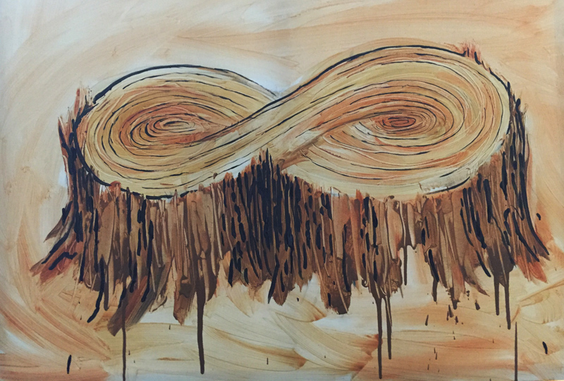
A simple doodle drawing that has become a painting.
When Here and Now Cease to Matter
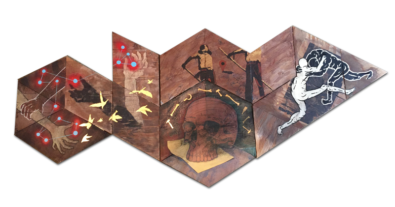
4 Quartets quartet interpretations Babel 2.0, 55Wx54H” Descent of Man, 66Wx44H” Jason Emmons, Jeff Del Nero, Stella Perez, Michael Largent Burnt Norton “At the still point of the turning world. Neither flesh nor fleshless; neither from nor towards, at the still point, there the dance is…surrounded by a grace of sense, a white light still … Read more
Hopes & Dreams

Hopes & Dreams
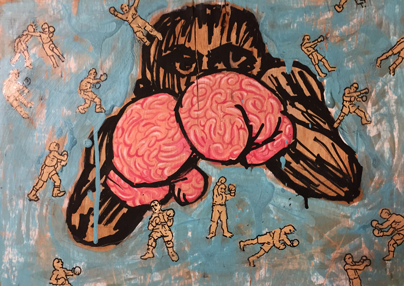
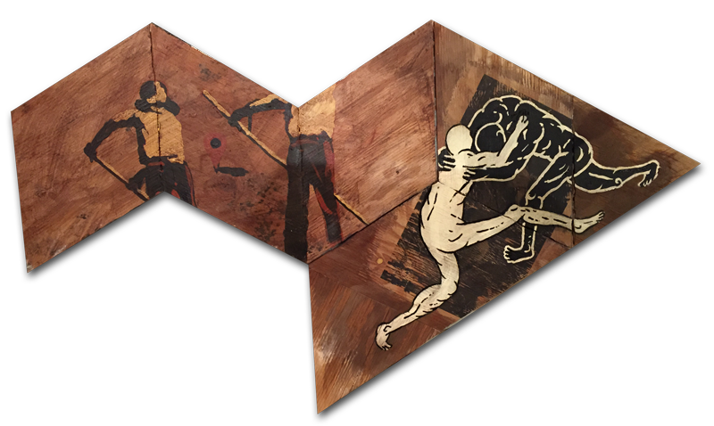
A work on panel (plywood) + acrylic. An idea that came along while thinking about being fragile. Hopefully, this will be an allegory for all of us. Everyone must risk being known, being public, interviewing for jobs or meeting new people. To move forward in life there is a fight that must happen.I thought about having ideas and thoughts about one’s future. Along the way there are successes and most likely many more failures. This is not necessarily about boxing, but about thoughts/ideas and effort/sweat going towards a better future — or a future that is being wrought out of life with many challenges along the way. This image became an essential one for me as I think about my station in life and what will be next. I have hopes and dreams, and I know the long shot that it will be if they come to pass. The “long shot” idea led me to the boxer. Brains or brawn, which will it be? Thinking about working as a creative and putting ideas out there for all to see. Currently at Exhale Unlimited Gallery, Chinatown, Los Angeles.
ExEden

here is the finished (so far) version of what I am calling “ExEden”
Ascent & Descent of Resourcefulness
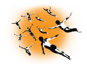 Ascent / Descent of man. Resourcefulness in regards to dreams and solutions to difficult challenges.
OK, flying over land. My goal was to have some textural patterns that would clearly be agricultural. This is still way-in-progress. My other intent was the Monopoly™ houses. More resolved, but will be in the additional areas surrounding the flying man.
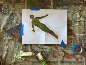 More thought about man’s ability to do things that are amazing to us — but only as far as we can see. We are amazed too easily.
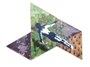 The houses will be symbolic of all culture, building, homes, lifestyles.
Some Combines of the Rhombus Paintings
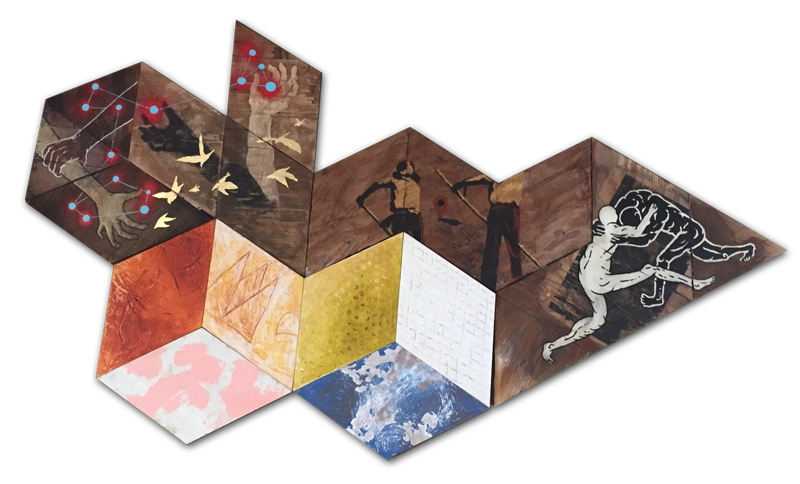 There seems to be some potential for experimenting with combinations of different rhombus polyptych’s.
I have been looking at how this may work into a much larger statement. The idea being that I have more than one individual piece that can be displayed in many potential forms.
A type of narrative that is more in keeping with how the world is perceived to us—a tapestry of seemingly-unconnected events.

The thought that there are events happening around us in a many-faceted cacophony which we pass through like a needle through fabric. We are affected by the events immediately around us and ripples of events surrounding us in radiating intersections.
Jennifer Bartlet / Elizabeth Murray / Jim Shaw / Mark Bradford / Tom Sachs / Robyn O’Neil
“You have to follow the work where it wants to go—it’s not about some little skill…” ~ Jackie Winsor
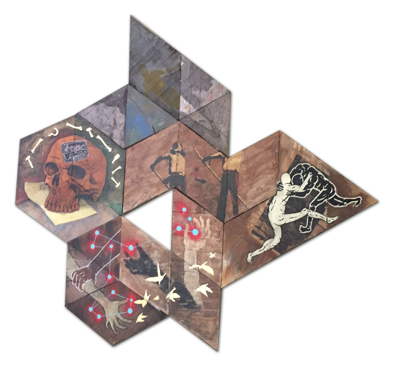
A couple of studio pictures
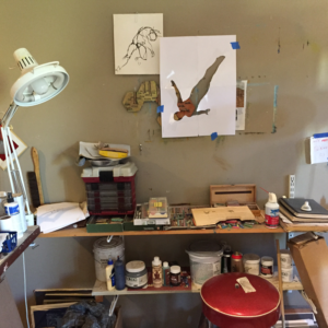 Just a couple of quick “candid” studio photos while working. I left some tools in there to get a perspective of some of the sizes.
The wall to the left shows a messy area, but most importantly, the silhouette stencil of my flying man.
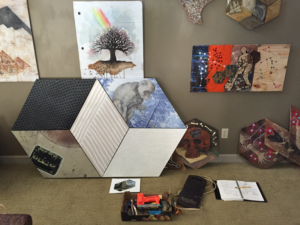
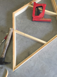
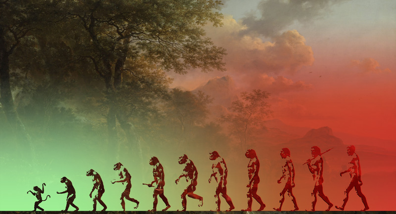
Just a thought about the descent of man.
 Thinking about man’s resourcefulness and the ability to learn, grow and recover what has been lost.
Texas Full of Tokyo’s
Take the expansive space of Texas with its iconic shape, then overlay into that the most dense city in the world. An experiment of a densely populated the area and let’s see what comes of this.
East & West collide. Many notions of both places can be construed. If you were to take these opposing mindsets and work them together what could happen?
USA & Tokyo Land Efficiency Model – Phase I
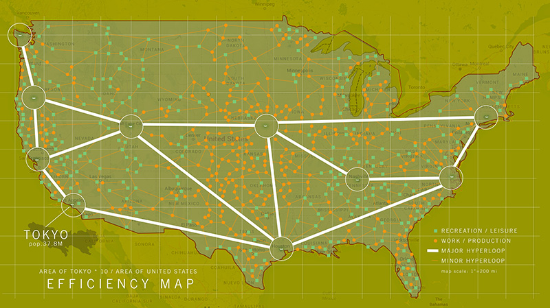
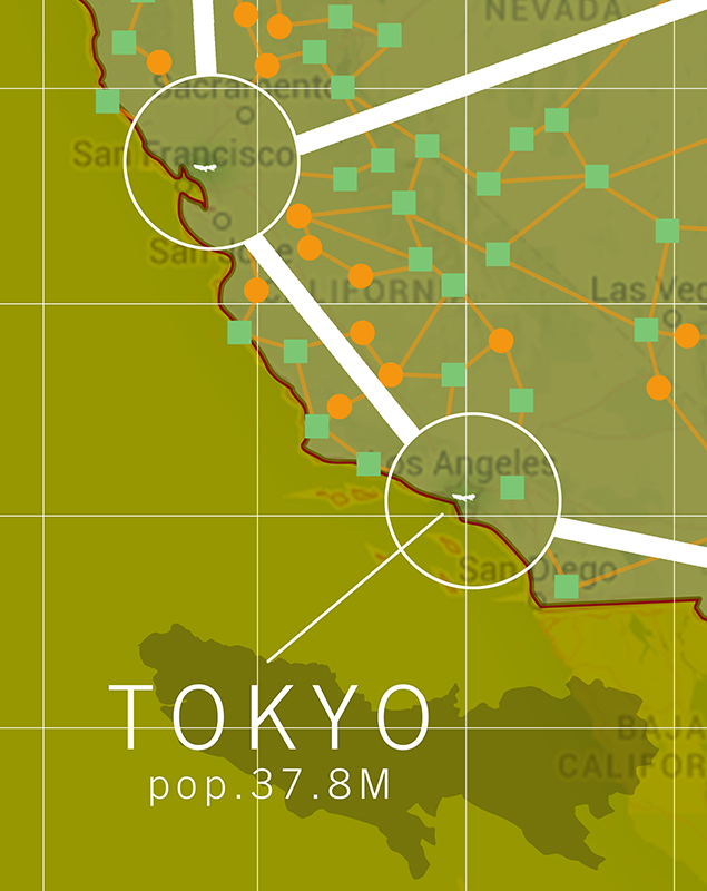
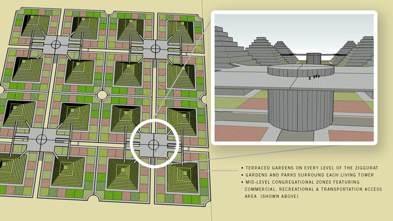
Thinking about the density of Tokyo and what it would be like to reduce our overall land footprint in the the United States to a microscopic level. I chose 10 locations to more than equal our population with a 25 year estimated advance in growth.
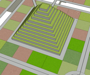
All living areas, cities that already have a dense population that can be migrated into the most efficient living centers – ziggurats that employ gardens and parks in proportion to each tower. With commercial areas for meeting and transportation centers to collect people at HyperLoop + This one too, hubs to easily get to specific work and recreational zones located around the U.S.
We currently have developed less than 5% of our land, but with focused density we could cut this by a factor of 100. Then use 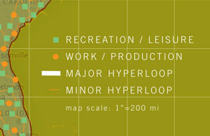 more open space for recreation and leisure. Also, by focusing our
agricultural and manufacturing to more efficient locations and geographic relationships we would gain a very powerful use of land.
We can start to be more efficient with how we handle our water, energy needs, food, living environment, daily regimen of exercise, human interaction and social connectedness.
 Other Research:
Babel 2.0
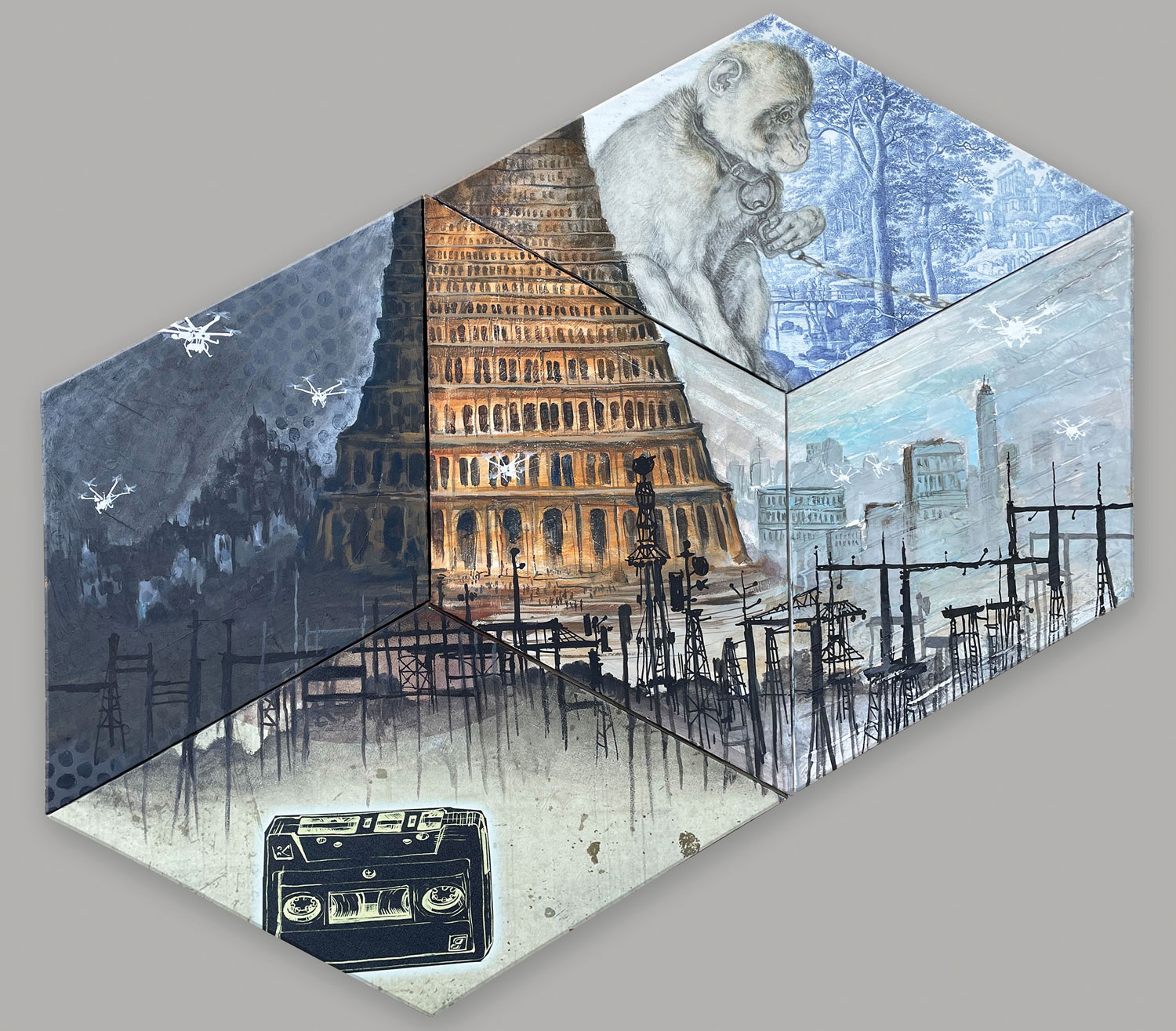
“If Necessity is the Mother of Invention, Then is Technology the Father of Dependence?”
With the continued use of the rhombus shape, I am questioning whether the shape lends itself to the idea of an underlying structure of science and math as an interlocking foundation for the inventive attempts at connecting technologies. A form that gives us a look at a world where people strive forward towards each other with the hope that each lunge will make us incrementally more self-sufficient while seeking to be further distanced from a consideration of the unseen.
Texas-World
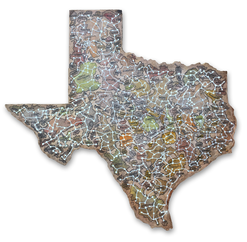
TEXASWORLD Plan
Acres in Texas: 171,904,640
World Population: 6,602,224,175
= 38.5 people per acre. Density Goal: 10 dwellings/acres = 3.8 people per dwelling.
If the world was turned into a Monopoly® Game. How long would it take to become unbalanced again? Can we make everything even? Is equality a possibility? Let’s give everyone the same access to food, shelter, etc., what would happen?
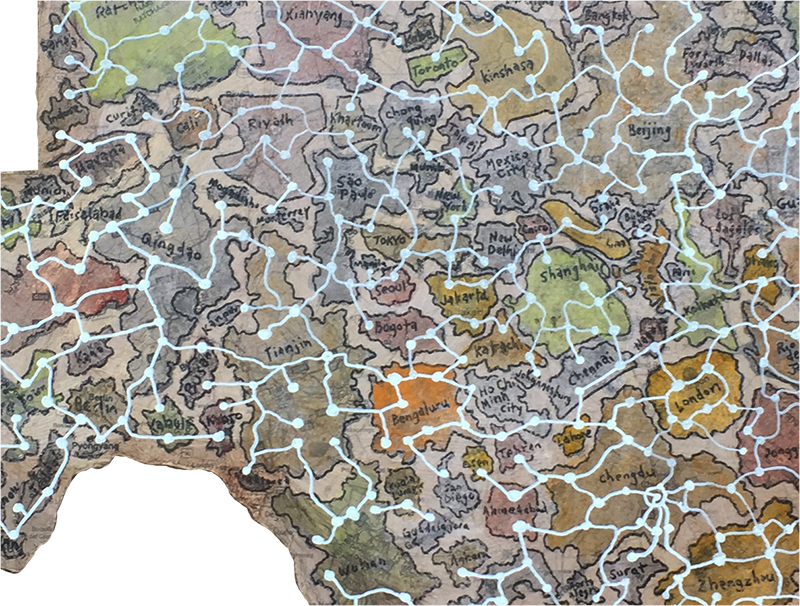
I mapped the 150 most populated world cities into the map of texas at 1″ = 20 miles. I found that so many cities have such a small footprint, while the largest cities in China occupy such large swatches of land it overwhelmed some of the space in the map. It was quite a contrast to see in front of me.

The exercise of connecting the cities with the white constellation reminds me of an internet that doesn’t have to follow any particular geographical order, but can jump randomly in any direction.
The idea of having the iconic shape of Texas as the first thing you see give an impression of one type of mindset. In many ways the shape of Texas is as recognizable as the U.S. map. Texas also is an strange representation of a “typical American” so it seems appropriate to use this shape as a generalization of our society.
Also, Texas having flown under six different country flags also seems to be a kind of reminder of the history of the state.
Hidden Decoy
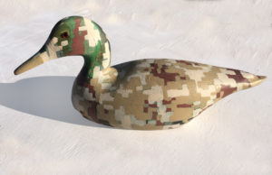 An oxymoron, The attraction is hidden. A decoy that would lead an unsuspecting duck to its demise. The surface now being camouflaged obscures its intent. This being both something to attract and hide is a curious combination.
It’s a mixed-metaphor and begs a question of the purpose. Many times we are attracted to dangerous situations and do not see them coming.
The camouflage style being of the digital style adds another layer to the idea and the hand-painted application can bring yet other layers of questioning.
Math Lesson, A Tale of Two Cities
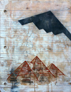
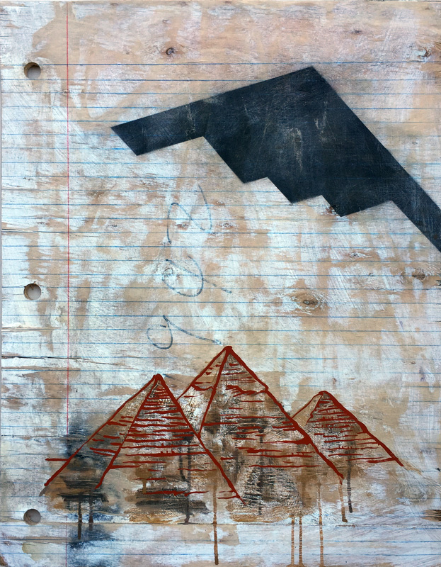
The great pyramids of Giza, Khufu, Cheops. B-2 Stealth Bomber. 1942. Math Lesson, A Tale of Two Cities, thinking about afterlife, and ways to maneuver the great beyond. Thinking about vehicles in that process.
If I loose my grip, will I take flight?
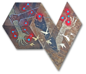
“If I loose my grip, will I take flight?” a lyric from a Bruce Cockburn song called Strange Waters.
This is quite wonderful double entendre regarding holding on to things that either hold you down or potentially keep you safe vs the idea of hanging on to a branch on a cliff, or an airplane wing that once you have let go, you will surely die.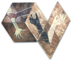
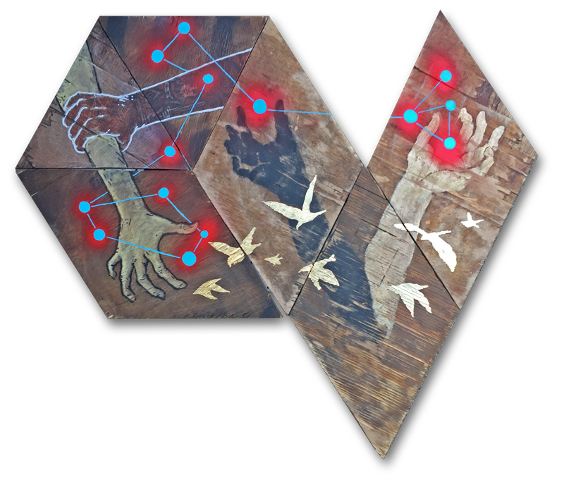
The imagery here is about hands, arms, etc. They are also of different colors. This is intentional and supposed to call you to compare.
Both scenarios are different intentionally too.
The imagery here is about hands, arms, etc. They are also of different colors. This is intentional and supposed to call you to compare.
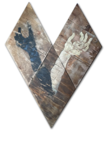
The imagery here is about hands, arms, etc. They are also of different colors. This is intentional and supposed to call you to compare.
Sisyphi
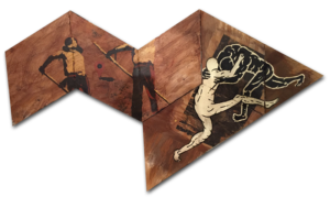 I have this thought that has been progressing and I am starting to get more of a positive feeling about the combination of figures. A lot of talk with this work has been centered around the contrast of the two scenes. Thoughts about location and activity. How we are not naturally able to coexist. While there’s the aspect of work and war, there is also the concept of how work vs. play can be derived here too.
