USA & Tokyo Land Efficiency Model – Phase I

US & Tokyo Proportion Efficiency Map 1:200mi scale.

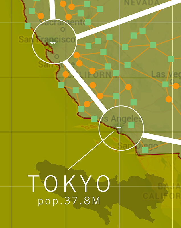
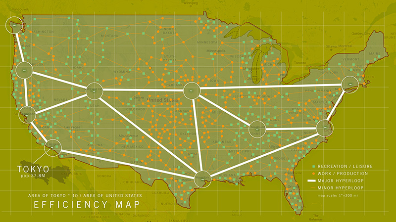
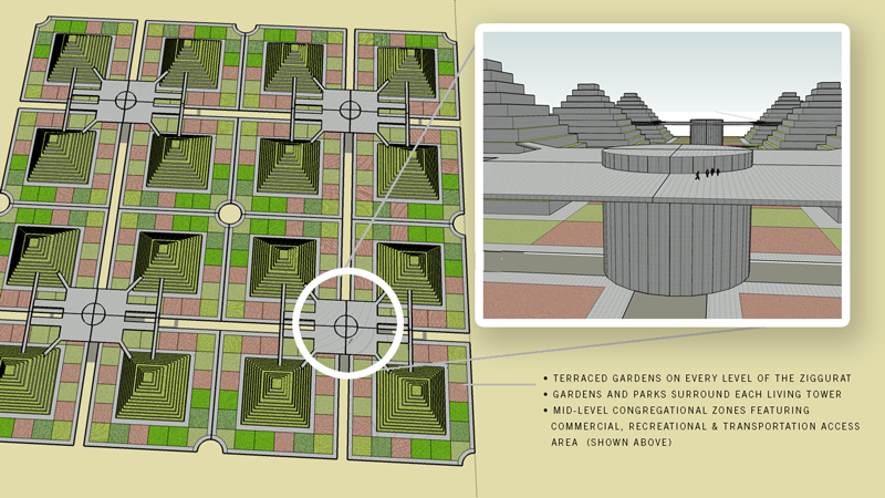
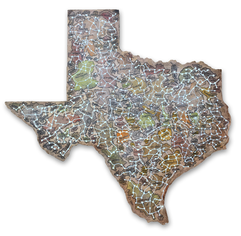
Thinking about the density of Tokyo and what it would be like to reduce our overall land footprint in the the United States to a microscopic level. I chose 10 locations to more than equal our population with a 25 year estimated advance in growth.

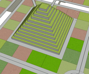
All living areas, cities that already have a dense population that can be migrated into the most efficient living centers – ziggurats that employ gardens and parks in proportion to each tower. With commercial areas for meeting and transportation centers to collect people at HyperLoop + This one too, hubs to easily get to specific work and recreational zones located around the U.S.

We currently have developed less than 5% of our land, but with focused density we could cut this by a factor of 100. Then use 
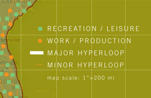
more open space for recreation and leisure. Also, by focusing our

agricultural and manufacturing to more efficient locations and geographic relationships we would gain a very powerful use of land.

We can start to be more efficient with how we handle our water, energy needs, food, living environment, daily regimen of exercise, human interaction and social connectedness.
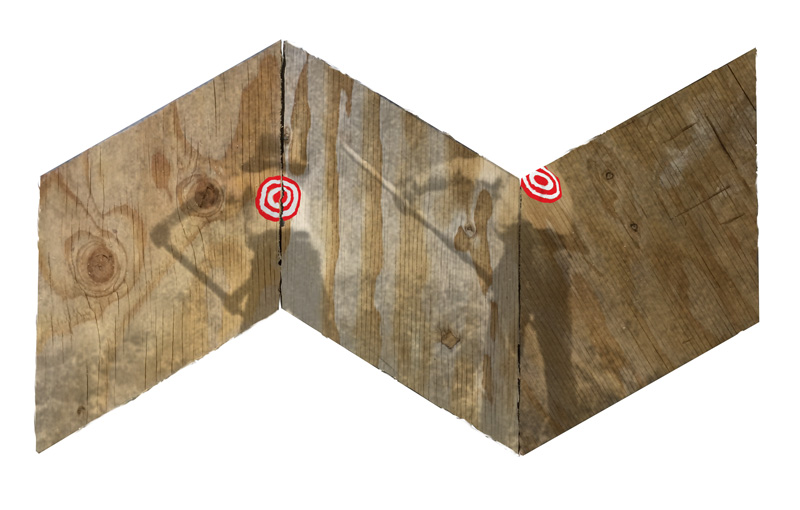
ziggurat city plan based on .5 mile grid.

Other Research:

Live in a skyscraper:
Housing Projects
1 square mile project – utopian environment possible?
Water plan
Water / sewer potential
Food potential
Food handling, containers reuse, recycle:
Power potential
Travel
Clothing / Practical yet room for personal expression: Bamboo / Cotton
Outdoor Health, Recreation & Activities: see map
Vacations: see map
Arts:
Entertainment:
Employment:
Manufacturing: see map
Building Materials: see map
Spare Parts & Repairs: see map
Cemeteries:
Faiths:

Babel 2.0

Painting of Babel
Babel 2.0, Acrylic on Canvas, 56x59in, 2016-2020 - Jeff Del Nero

“If Necessity is the Mother of Invention, Then is Technology the Father of Dependence?”

With the continued use of the rhombus shape, I am questioning whether the shape lends itself to the idea of an underlying structure of science and math as an interlocking foundation for the inventive attempts at connecting technologies. A form that gives us a look at a world where people strive forward towards each other with the hope that each lunge will make us incrementally more self-sufficient while seeking to be further distanced from a consideration of the unseen.

Texas-World

texas-world-map-800
“Texas-World“, 33.5 x 32 in., scale: 1″=20miles, plywood map of the world’s 150 largest cities mapped into the geographical space of Texas, USA. J. Del Nero, 2016

TEXASWORLD Plan
Acres in Texas: 171,904,640
World Population: 6,602,224,175
= 38.5 people per acre. Density Goal: 10 dwellings/acres = 3.8 people per dwelling.

If the world was turned into a Monopoly® Game. How long would it take to become unbalanced again? Can we make everything even? Is equality a possibility? Let’s give everyone the same access to food, shelter, etc., what would happen?
I mapped the 150 most populated world cities into the map of texas at 1″ = 20 miles. I found that so many cities have such a small footprint, while the largest cities in China occupy such large swatches of land it overwhelmed some of the space in the map. It was quite a contrast to see in front of me.
texas-world-map-detail
The exercise of connecting the cities with the white constellation reminds me of an internet that doesn’t have to follow any particular geographical order, but can jump randomly in any direction.

The idea of having the iconic shape of Texas as the first thing you see give an impression of one type of mindset. In many ways the shape of Texas is as recognizable as the U.S. map. Texas also is an strange representation of a “typical American” so it seems appropriate to use this shape as a generalization of our society.

Also, Texas having flown under six different country flags also seems to be a kind of reminder of the history of the state.

Two Drawings Sold

Prayer1_800 3-Smoke-Stacks_800Two drawings sold to some great friends. Thank you for thinking of my work as a gift. Albeit a very special event. Happy Birthday Nina! I am so glad these will be with your family. Andrew, a very heartfelt “thank you” for wanting to acquire these for Nin.

Both of these works share a particular use of metallic and interference paint. This changes based on the lighting, causing some reflectivity of the parts where that paint exists. The paint that changes brings an ethereal quality to the work, this makes me think of how quickly light changes around us.

Hidden Decoy

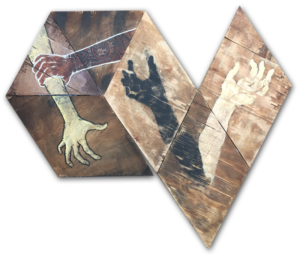
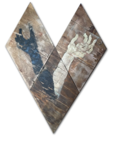
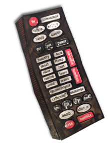
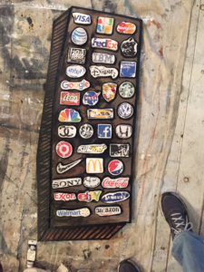
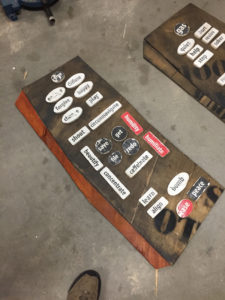
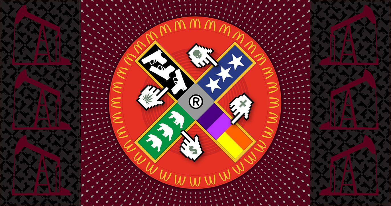
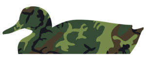
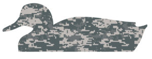
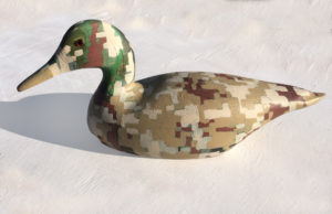
An oxymoron, The attraction is hidden. A decoy that would lead an unsuspecting duck to its demise. The surface now being camouflaged obscures its intent. This being both something to attract and hide is a curious combination.
It’s a mixed-metaphor and begs a question of the purpose. Many times we are attracted to dangerous situations and do not see them coming.
The camouflage style being of the digital style adds another layer to the idea and the hand-painted application can bring yet other layers of questioning.

Math Lesson, A Tale of Two Cities

Math Lesson: A Tale of Two Cities
“Math Lesson, A Tale of Two Cities” 30.5 x 24 in., mixed on panel

The great pyramids of Giza, Khufu, Cheops. B-2 Stealth Bomber. 1942. Math Lesson, A Tale of Two Cities, thinking about afterlife, and ways to maneuver the great beyond. Thinking about vehicles in that process.

If I loose my grip, will I take flight?

“If I loose my grip, will I take flight?”

“If I loose my grip, will I take flight?” a lyric from a Bruce Cockburn song called Strange Waters.
This is quite wonderful double entendre regarding holding on to things that either hold you down or potentially keep you safe vs the idea of hanging on to a branch on a cliff, or an airplane wing that once you have let go, you will surely die.
The imagery here is about hands, arms, etc. They are also of different colors. This is intentional and supposed to call you to compare.
Both scenarios are different intentionally too.

The imagery here is about hands, arms, etc. They are also of different colors. This is intentional and supposed to call you to compare.

The imagery here is about hands, arms, etc. They are also of different colors. This is intentional and supposed to call you to compare.

Sisyphi

I have this thought that has been progressing and I am starting to get more of a positive feeling about the combination of figures. A lot of talk with this work has been centered around the contrast of the two scenes. Thoughts about location and activity. How we are not naturally able to coexist. While there’s the aspect of work and war, there is also the concept of how work vs. play can be derived here too.

Triggers Murmuration

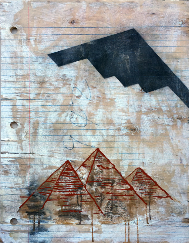
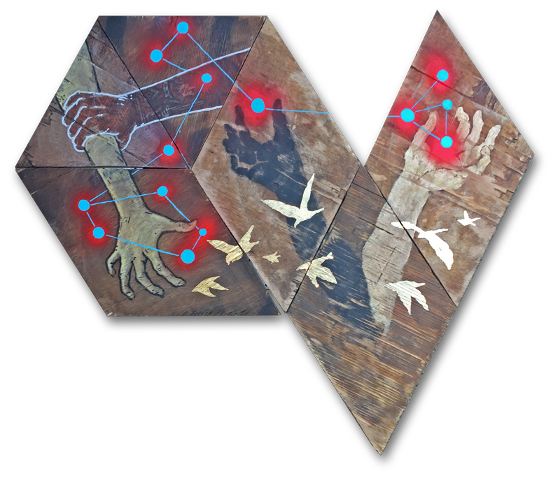
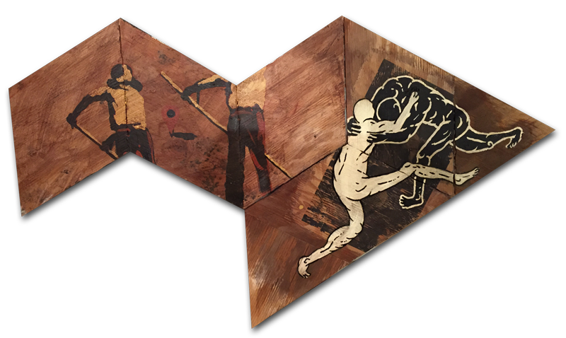
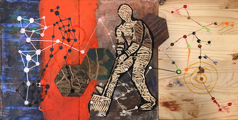
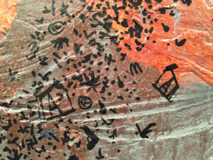
This canvas is a work in progress utilizing some of the symbols from my “anti-flag” which I am now considering more of a “trigger” flag. Flags tend to be some thing people are for – this flag is about what people are against.

The murmuration is a way of capturing an initially beautiful image that gets progressively less beautiful when looked at closer.

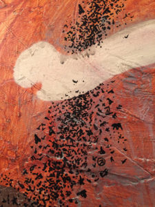
I still have quite a bit of work to do on this.

Life Remote *more*

life remote
“Life Remote 2” – 19x48in, plywood and words, Jeff Del Nero, 2017

Life Remote

These are in progress. I have somewhat of an idea that is not quite ready yet, but I am still working on this concept. To me it’s like a poem of words that we use in an automatic way. I think it can be a fun idea to think that our lives are managed in a “remote” kind of interaction.

We sit in one place and try to make things happen in another place. Using this bit of technology to assist us. This is our phone or our computer that becomes an extension of us. Although, many times there are not buttons for the things we wish could happen. Or events that we cannot control or undo.

life remote
“Life Remote 1” – 19x48in, plywood and words, Jeff Del Nero, 2017

My goal is to have the surface of this allude to life. The worn, random effects of living through life. The inevitable wear-and-tear that happens to us.
Because UX (user experience) is important to us in our daily lives, and my job many times is largely associated with a user’s experience, I wanted this to be less user friendly; on/off buttons are randomly placed in the midst of banks of buttons. Also, purposely dis-organizing usage, so it would be work to locate the correct button for the desired result. Chances for errors are increased.

Life Remote

To have a remote that would help in life situations speaks to our dependence upon the technology around us. I am particularly aware of this when my analog life seeks an “undo” when there are none available. Looking for the particular way to make this remote, and while considering some other ideas along the way, this seems to be a fun and worthwhile project to continue with.

Currently, I am experimenting with scale for this project and some other ways of application of the imagery. This approaches some of the particular desires I have to use all of the tools I work with every day. Both digital and analog. Especially considering a way of having words play into my concept as well.

The other remote concepts are not mocked up yet, but as I get into this one I plan on evolving into the next remote ideas as well.

Decoy Concept

Temptation Concept / Sin Concept

In thinking of the dilemma of life’s journey, I have been seeking images that describe the challenges with which we are daily faced. An idea I had was to show temptation in a way that could be depicted in a graphic form.

Temptation Concept / Sin Concept

The oxymoron of a camouflaged decoy is one that

Read more

Is This What I Do? Or, is this What I Am?

Some *more* Thoughts.

 
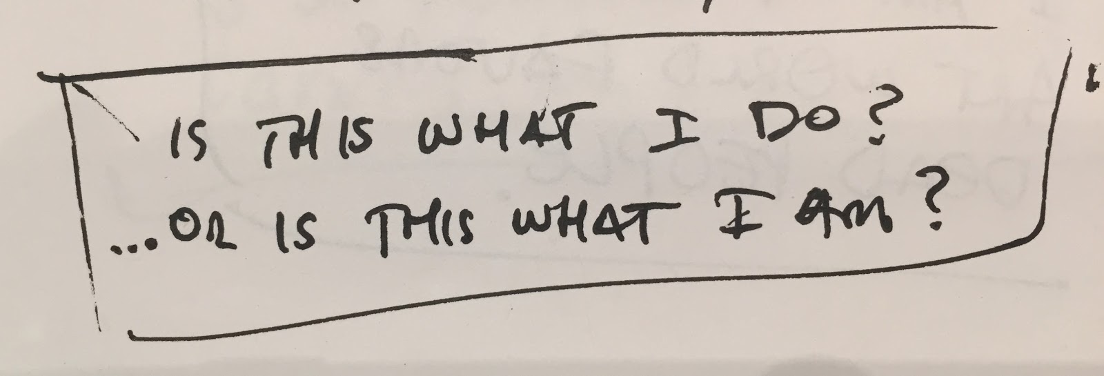
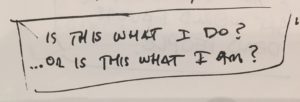
“Is This What I Do? Or, is this What I Am?”
~ thoughts

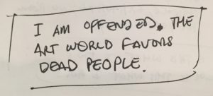
“I am offended. The Art World Favors Dead People.”

~  thoughts
 

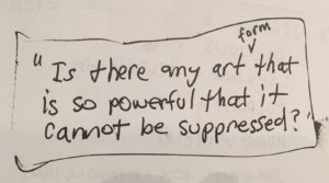
“Is there any art form that is so powerful that it cannot be surpressed?” ~ thoughts